User Research, Personas, Wireframes, Prototyping
PROBLEM
Users encounter difficulties in navigating the complex website structure, leading to frustration and limited engagement with essential resources and updates. The lack of an intuitive design and outdated content diminishes the website's ability to serve as a reliable hub for crucial information related to national security and emergency preparedness.
SOLUTION
The proposed solution for the Department of Homeland Security (DHS) website redesign involves implementing a comprehensive strategy to create an intuitive, user-friendly, and visually appealing platform that effectively communicates the department's mission and services to the public.
original Website
UNDERSTANDING THE USER
To ensure a successful redesign of the Department of Homeland Security (DHS) website, a comprehensive understanding of the target users is crucial. The user statement focuses on gathering insights into the needs, preferences, and behaviors of the diverse audience that interacts with the website, including citizens, businesses, government agencies, and other stakeholders.
RESEARCH FINDINGS
- 20% of visitors are businesses seeking information on cybersecurity and compliance guidelines.
- 60% of users reported difficulties finding specific information due to complex website navigation.
- 35% of users suggested improvements to make the website more accessible for individuals with disabilities.
KEY INSIGHTS
Here are a few insights based on the information gathered in my research:
- Users encounter difficulties navigating the current website, leading to frustration and limited access to essential information and resources.
- Improving the website's content organization and navigation is crucial to provide users with easy access to relevant information.
- The website caters to a diverse user base, including citizens, government agencies, businesses, international travelers, and immigrants, each with specific needs and expectations.
70%
of users felt that the website was in need of improvement
Potential Solutions
Themes List
- Create a cohesive and harmonious design
- Simplify site navigation
- Prioritize accessibility


COMPETITOR RESEARCH
- CBP and TSA stand out in offering user-friendly navigation and personalized content, emphasizing the significance of intuitive design for easy access to essential information.
- FEMA's multilingual support showcases the importance of catering to diverse language preferences, enhancing inclusivity for all users.
PERSONA
With meticulous gathering and organization of research data, it became essential to create a persona representing the target user within the Department of Homeland Security. This persona embodies a motivated and inquisitive individual, serving as a guiding beacon throughout the entire product life cycle, guaranteeing a steadfast focus while making pivotal design decisions.

SITEMAP
After evaluating the pages, it was concluded that a simplification of the navigation tabs would help improve the overall user experience and flow on the website

SKETCHES
At the initial stage of the design process, I commenced by creating several fundamental sketches to establish the overarching layout structure for the project. These preliminary concepts were visually represented and are depicted below.
FINAL SKETCH LAYOUT
WIREFRAMES
Upon finalizing the sketch layout, the next step involved translating those concepts into wireframes. To achieve a clear visualization of the app's structural elements, I developed low-fidelity wireframes for the main pages using the Figma design tool.
LO FIDELITY PROTOTYPE
With the application's structure firmly established, the focus shifted to crafting a low-fidelity prototype. This pivotal step allowed for a practical evaluation of the design's enjoyability and functionality at this phase of development.
USER TESTING
Collating valuable insights from users, the subsequent adjustments were implemented and are showcased below.
Iterations
- Improved Hero images
- Information architecture
- Excessive information consolidated
- Search bar conveniently added at top of page
- About section added
UI STYLE

FINAL DESIGN
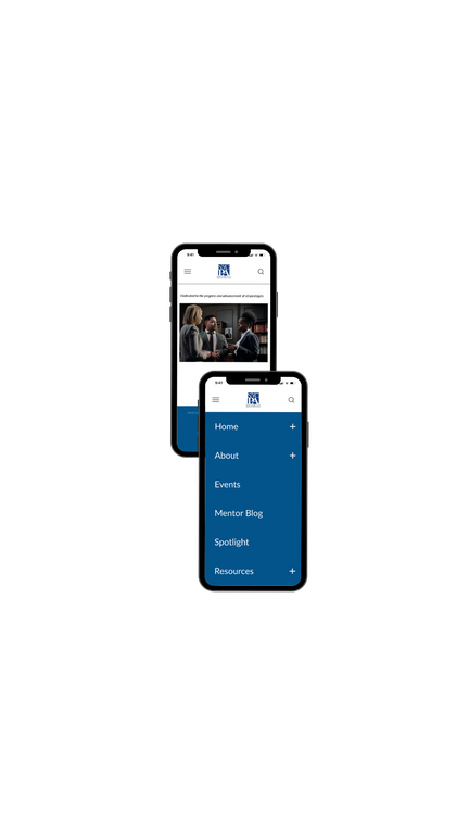
The final design for the Department of Homeland Security website navigation aims to provide a seamless and intuitive user experience, ensuring easy access to critical information and resources. Through extensive user testing and iterative design improvements, we have refined the navigation structure to accommodate the diverse needs of citizens, government agencies, businesses, and international travelers.
TAKE AWAYS & NEXT STEPS
Prioritizing inclusivity and accessibility ensures that the website caters to all users, regardless of their language preferences or abilities, fostering a sense of inclusiveness and equality.
Next Steps:
- High-Fidelity Prototyping: Develop high-fidelity prototypes based on the low-fidelity wireframes, integrating visual assets and interactive elements to provide a realistic representation of the website's user interface.
- Usability Testing: Conduct extensive usability testing with real users to validate the redesigned website's effectiveness in meeting user needs, identifying any potential usability issues, and making necessary improvements.
- Design Iterations: Based on the user feedback and insights gathered during the research, conduct further design iterations to fine-tune the website's visual elements, ensuring it aligns with the department's branding and objectives.


