KOREAN-AMERICAN COMMUNITY FOUNDATION
"Building Bridges, Empowering Dreams: Uniting the Korean-American Community for a Brighter Future."

DURATION
8 weeks
TYPE
Website Re-design
RESPONSIBILITIES
User Research, Personas, Wireframes, Prototyping
The Korean-American Cultural Foundation (KACF) is faced with the challenge of crafting an engaging digital experience that effectively disseminates information on Korean-American culture, resources, and current news and events. Furthermore, the organization is encountering difficulties in securing and sustaining an adequate influx of digital donations essential for its continued growth and prosperity.
PROBLEM
SOLUTION
To enhance the platform's appeal and drive higher user engagement, it is essential to develop a visually captivating website. This entails incorporating various elements, such as compelling call-to-action buttons, an optimized navigation system, and an aesthetically pleasing user interface (UI) style. By implementing these enhancements, we aim to significantly boost user traffic and foster increased interaction with the foundation's offerings.
original Website
UNDERSTANDING THE USER
Prior to initiating the design process, I recognized the importance of gathering additional context to inform my approach effectively. My primary objective was to explore various users of the site and identifying potential challenges they may encounter.
75%
of users felt that the website needed improvements
Potential Solutions
Themes List
- Develop a way to bring more users to donate
- Create a more welcoming digital environment
- Expand on the users curiosity of Korean-American culture
KEY INSIGHTS
Based on the comprehensive research conducted, the following insights have been discerned:
- A significant portion of users express a desire for a captivating website that effectively encapsulates the essence of Korean-American culture.
- Users exhibit a higher inclination towards making donations when they possess a clear understanding of how the proceeds will be utilized to benefit the cause.
- Notably, a considerable number of users are inclined to participate in events that contribute to the support and promotion of Korean-American culture.


COMPETITOR RESEARCH
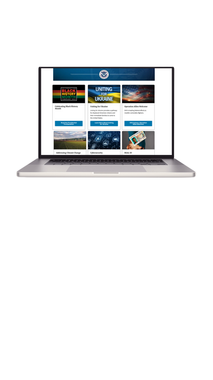
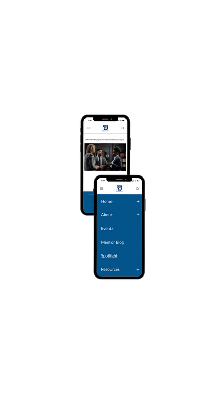
To gain insights into the market, I conducted a thorough observation and analysis of various competitors, focusing on their unique offerings to users. In particular, I extensively studied two successful digital products in the community foundation field: the NAACP and the ICPA.
The NAACP stands out for its compelling homepage, effectively capturing users' attention and conveying its mission and services. On the other hand, the ICPA excels in facilitating connections among like-minded individuals, fostering a sense of community and engagement.
CARD SORTING
After evaluating the pages, it was concluded that a simplification of the navigation tabs would help improve the overall user experience and flow on the website


PERSONA
Upon gathering and structuring the research data, the next step involved creating a persona to represent the target end-user visually.
Throughout the entire product life cycle, this persona served as a constant reference, guiding design decisions and ensuring a user-centric approach.

SKETCHES
At the onset of the design stage, I began with initial sketches outlining the desired overall layout structure. The primary focus was to present users with a selection of various donations and accompanying descriptions detailing how the proceeds would be utilized.
These concepts were visually depicted in the sketches presented below.
FINAL SKETCH LAYOUT
WIREFRAMES
Upon finalizing the layout through the completion of the sketching phase, the next step involved translating those concepts into wireframes. To effectively visualize the app's structure, I developed low-fidelity wireframes for the main pages using the Figma design tool.
LO FIDELITY PROTOTYPE
With the application's structure now established, the subsequent step involved crafting a low-fidelity prototype. This invaluable stage allowed for assessing the current design's level of enjoyment and functionality, providing critical insights for further refinement.
USER TESTING
Following standard practice, user testing was conducted with multiple participants before concluding the design phase with high-fidelity mockups. Gathering valuable insights from the users, the subsequent changes were implemented, and the revisions are showcased below.
ITERATIONS
- UI style guide
- Consolidated text into tabs
- Tied up loose ends on interactions

TAKE AWAYS & NEXT STEPS
The redesign of the Korean American Community Foundation website presents a compelling opportunity to elevate the organization's online presence and impact. By crafting a visually appealing, user-friendly, and culturally relevant platform, the new website can effectively engage the Korean American community and beyond.
Key considerations for the redesign:
- User Experience Optimization: Prioritize a seamless user experience, making information easily accessible, navigation intuitive, and interactions enjoyable for both English and Korean-speaking users.
- Donation and Membership Integration: Streamline the donation and membership process, facilitating user engagement and support for the foundation's programs.
- Analytics and Data Tracking: Implement analytics tools to monitor user engagement, interactions, and feedback, facilitating data-driven improvements over time.
By approaching the redesign with a user-centered perspective and embracing the unique cultural context, the Korean American Community Foundation can create a website that serves as a powerful platform for community growth, empowerment, and impact.


